
Why is it important to know Power Query – Excel?
November 16, 2017
An Evening of Celebration and Commitment
December 29, 2023
This article explores how to leverage Python's graphing capabilities in conjunction with Power BI, enabling the creation of automated dashboards and reports.
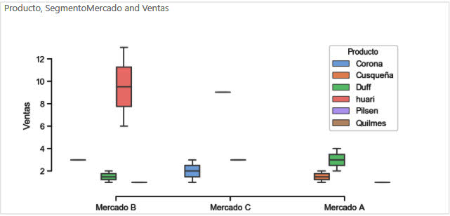
Within the world of Data Science, it is important to be able to integrate different tools with the idea of being able to get the most out of each one. For example, if we want to have Box Plot graphs, to know the average Purchase Frequency of a Beer x Market Segment.
For this it is necessary to have the following tools:
- Power BI Desktop Superior August 2018 (Self-service BI tool)
- Install Python (Programming language widely used for Data Analysis - Data Science)
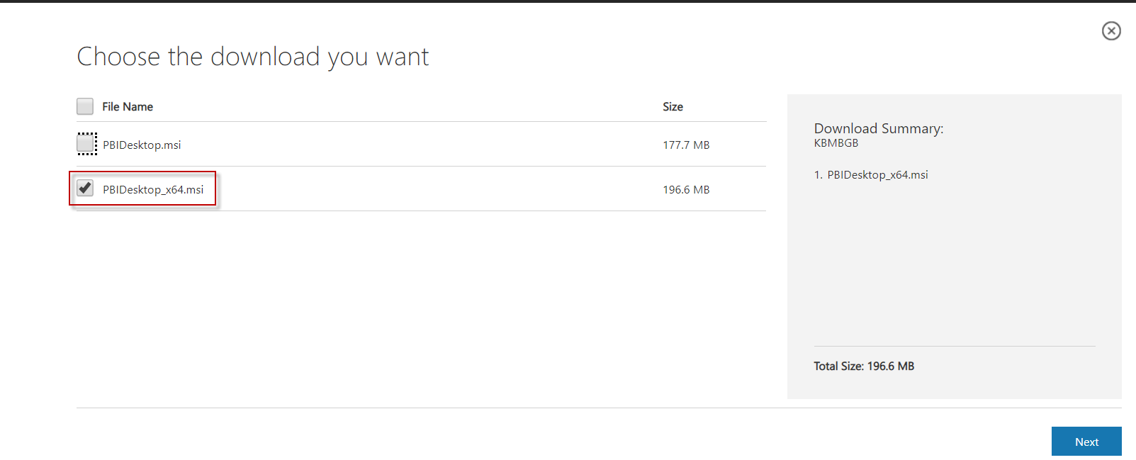
Once you have accessed the Power BI download link, choose the 32-bit or 64-bit version depending on your computer.
Installing the product is free in the Power BI Desktop version.


Once the Power BI Desktop is installed, proceed to install Python, follow the options given by default (Next - Next).
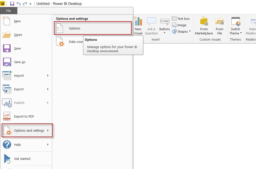
- Proceed with the configuration of Power BI for Python support, taking into account that it is possible to integrate it in a similar way with R language.
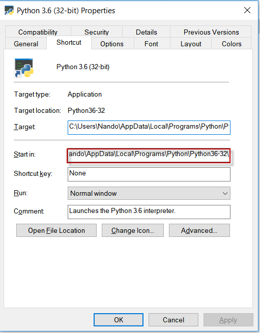
It is necessary to provide the path to the directory where Python is installed.


Follow the next steps in case you do not have the correct path.
Use that path inside Power BI.

You will need to restart the Power BI Desktop, after completing the configuration. Once you reopen the Power BI desktop, verify that there is a new component in the palette.
- To create graphs, we will utilize the Pandas, Seaborn, and Matplotlib libraries.
To install the libraries, follow these steps: first, open a Command Prompt (DOS) terminal.


- Load the Test data to be able to use the Python component, you can use the font of your choice, basically it requires 3 variables, y = Sales Quantity, x = Market Segment and legend = Product.
Click on the Python component, and select the columns you want to display.


Enter the following Python code:
# Importing seaborn and pyplot libraries
import seaborn as sns
import matplotlib.pyplot as plt

# Choose the color palette
sns.set(style=”ticks”, palette=”pastel”)

# Plot the Box Plot, with the variables x, y, and z, taking into account that the data are stored in the variable dataset.
sns.boxplot(x=”D.Seg.Mkt” , y=”#Cj Vta Bruta”,hue=”D.Mar” ,data=dataset )
sns.despine(offset=10, trim=True)

# Display the graph
plt.show()
As a last step it is possible to publish the report, unfortunately, it is not yet supported in the cloud for now.


